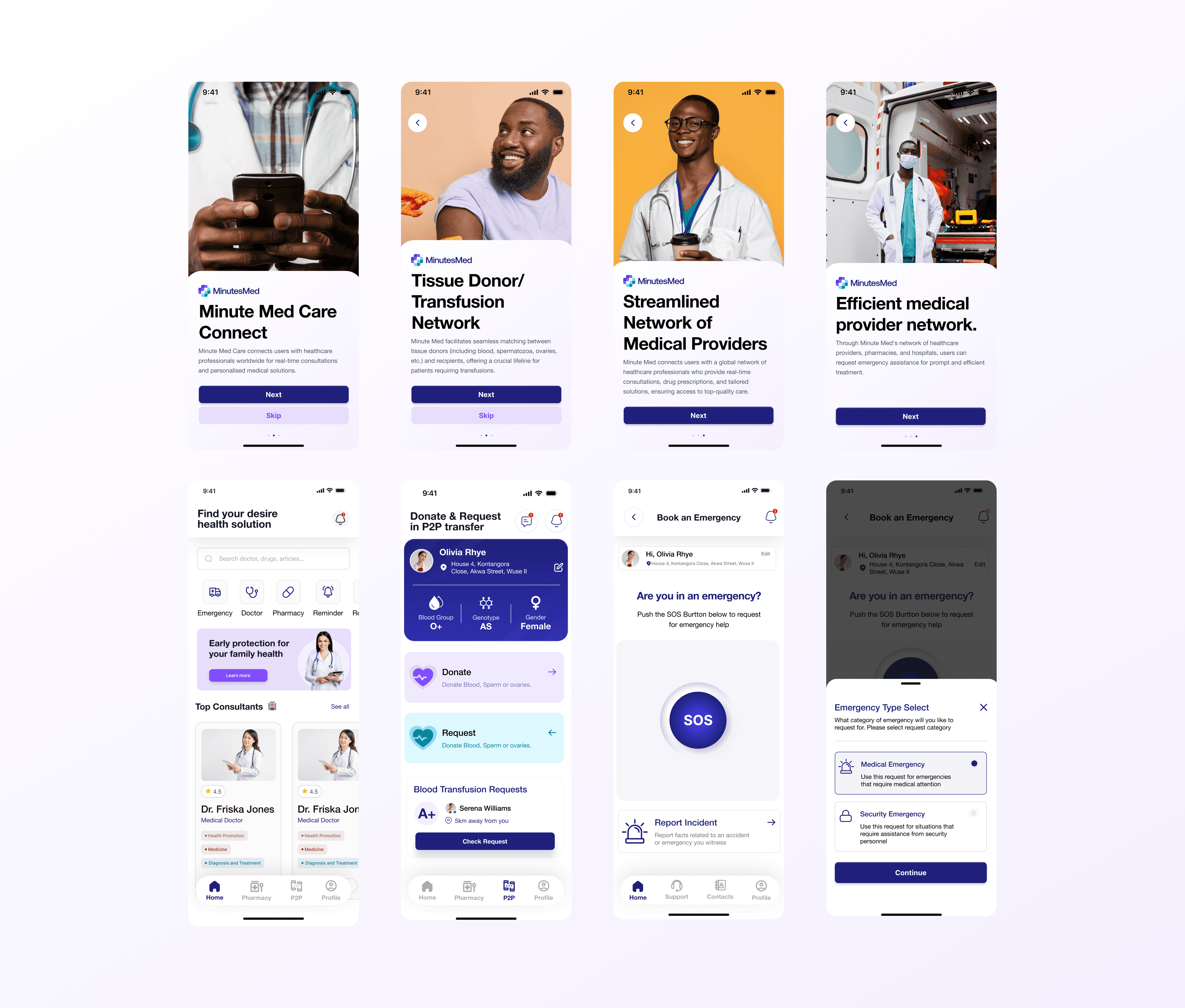
MinutesMed Mobile App
MinutesMed is a healthcare technology startup exploring how technology can make tissue donation and access more efficient, transparent, and accessible across Africa.
Year
2024
Scope
Mobile App, UI/UX Design, User Experience
Client
MinutesMed
Duration
6 months
The Challenge
Designing trust into a healthcare marketplace.
Healthcare is fundamentally a trust-driven industry.
For MinutesMed, that challenge was even more significant because the platform dealt with highly sensitive medical resources, including tissue and blood-related services.
The proposed platform needed to connect different stakeholders while ensuring that the information and resources being exchanged could be carefully verified.
The brand therefore needed to communicate:
Trust
Safety
Credibility
Accessibility
Technology
Human impact
At the same time, it needed to avoid feeling overly clinical or intimidating.
The challenge was to create an identity that could make an emerging healthcare technology platform feel credible enough for healthcare environments while remaining approachable to everyday users.
The Opportunity
Technology can simplify access to critical healthcare resources.
MinutesMed was conceived around a simple but important opportunity:
Use technology to make the discovery, verification, and access of donated or available medical tissues more systematic.
The proposed platform would connect two primary account types:
Clinics
Healthcare institutions responsible for providing and verifying medical resources.
Donors
Individuals willing to make relevant donations available through the platform.
This created the foundation for a healthcare marketplace where verification and trust would be central to the experience.
The Approach
Building a brand around trust, access, and human impact.
My role focused on translating the product's mission into a visual identity that could work across the company's future digital ecosystem.
I approached the identity through three core ideas:
01 — Trust: Healthcare users need confidence in the systems they're interacting with.
The visual language therefore needed to feel structured, credible, and dependable.
02 — Connection: MinutesMed exists to connect people and healthcare providers with resources that can improve or save lives.
The identity needed to communicate this idea of connection.
03 — Progress: The company was using technology to rethink how access to healthcare resources could work.
The brand needed to feel modern and forward-looking rather than like a traditional medical institution.
Visual Identity
Healthcare without the coldness.
The identity direction balanced the familiarity of healthcare branding with a more modern technology-driven aesthetic.
Instead of relying entirely on conventional medical symbols, the visual system explored a more contemporary approach that could represent people, connection, care, and technology.
The resulting identity was designed to be:
Clear
Easy to recognize and understand.
Approachable
Human enough to avoid feeling sterile.
Professional
Credible enough for healthcare environments.
Scalable
Flexible enough to grow with the digital product.
Designing for a Digital Product
The identity had to work beyond the logo.
MinutesMed wasn't being built as a traditional healthcare organization.
It was envisioned as a digital marketplace and technology platform.
That meant the identity needed to work across:
Product interfaces
Website
Mobile application
Social media
Marketing materials
Healthcare communications
Investor / business presentations
Future platform touchpoints
The visual system was therefore developed with digital scalability in mind.